Turning a 39-route bus network into a digital experience riders can rely on.

Turning a 39-route bus network into a digital experience riders can rely on.

Turning a 39-route bus network into a digital experience riders can rely on.

FOOTHILL TRANSIT

FOOTHILL TRANSIT

FOOTHILL TRANSIT

Transportation   •   Website + Mobile   •   Public Sector

Transportation   •   Website + Mobile   •   Public Sector

Research to Delivery

Real-Time Data UX

WCAG 2.1 Compliance

Information Architecture

Third-Party Integration

Team Management + Leadership

Mobile Design

Live bus tracking, a full information architecture rebuild, and WCAG 2.1 accessibility built into the structure from day one. For the riders who depend on transit as their primary transportation.

Live bus tracking, a full information architecture rebuild, and WCAG 2.1 accessibility built into the structure from day one. For the riders who depend on transit as their primary transportation.

ROLE

UX Lead, Sensis

Mar 2019 → May 2021

Launch

Feb 2023

KEY METRICS

  • Information architecture built around rider task

  • 5 interaction systems

  • WCAG Compliant

  • GTFS real-time integration

Mobile screen displaying live bus updates
Foothilltransit.org mobile home page
Mobile screen with bus schedule
The site was built around 39 routes. Riders did not need to know how the agency was organized. They needed to know where the bus was.

Context

39 routes. One broken digital experience.

39 routes. One broken digital experience.

Foothill Transit operates 39 bus lines connecting the San Gabriel Valley to L.A.'s urban centers, but its legacy website made riders work harder than the commute itself. No real-time data. Navigation built for the agency, not the rider. A digital presence that made public transit feel like a last resort.

Foothilltransit.org homepage before and after. After displays mobile site.

Navigation built around organization structure, not rider tasks. No real-time data.

Screenshots showing progressive disclosure in action: (1) the contact replacement modal, (2) the employer contributions form with conditional fields. Stack vertically within the column. (3) Inline error messaging for contact cards.

End-to-end UX ownership on a public sector project means being the only person who can see how all the pieces are supposed to connect.

MY ROLE

Lead UX, end to end.

At Sensis, I owned UX strategy, information architecture, the full wireframe library, and stakeholder alignment across a two-year engagement, from discovery through handoff.

Design completed May 2021; development and launch followed in February 2023, a realistic picture of large public-sector project timelines.

01

UX Strategy + Vision

Discovery → Direction

Stakeholder deep-dives, system audit, user interviews, and field observations. Translated findings into an experience strategy that balanced rider needs against transit agency constraints.

01

UX Strategy + Vision

Discovery → Direction

Stakeholder deep-dives, system audit, user interviews, and field observations. Translated findings into an experience strategy that balanced rider needs against transit agency constraints.

02

Design + Delivery

IA → Handoff

Full annotated sitemap, wireframe library, interaction specifications for GTFS real-time integration, onboarding flow, Trip Planner, and WCAG 2.1 compliance framework.

02

Design + Delivery

IA → Handoff

Full annotated sitemap, wireframe library, interaction specifications for GTFS real-time integration, onboarding flow, Trip Planner, and WCAG 2.1 compliance framework.

Four problems surfaced in the audit. The most important one had no name: the site was eroding trust in the service before riders ever reached the stop.

Challenges

Four problems worth solving.

A full system audit and stakeholder interviews surfaced the gaps between what the site offered and what riders actually needed.

01

Rider self-service breakdown

Poor navigation forced users to hunt for basic information, driving avoidable calls to customer service that strained operations and frustrated commuters.

01

Rider self-service breakdown

Poor navigation forced users to hunt for basic information, driving avoidable calls to customer service that strained operations and frustrated commuters.

02

No real-time information

Riders had no way to know where their bus was or when it would actually arrive. Static schedules left them guessing on the curb.

02

No real-time information

Riders had no way to know where their bus was or when it would actually arrive. Static schedules left them guessing on the curb.

03

Accessibility gaps

The legacy platform failed riders with disabilities, a significant share of the ridership, with no compliance framework, no keyboard navigation, and unreliable contrast.

03

Accessibility gaps

The legacy platform failed riders with disabilities, a significant share of the ridership, with no compliance framework, no keyboard navigation, and unreliable contrast.

04

Low rider engagement

A clunky digital presence made public transit feel unreliable before riders even reached the stop. The site was eroding trust in the service itself.

04

Low rider engagement

A clunky digital presence made public transit feel unreliable before riders even reached the stop. The site was eroding trust in the service itself.

Real-time data is not a feature. For a daily commuter on a curb, it is the difference between confidence and guesswork.

Research

Interviews + field observations

I conducted user interviews and field observations across daily commuters, first-time riders, and riders with disabilities, building a picture of how different people navigate the same 39 routes under very different conditions.

Four Foothill Transit rider persona cards: event-specific rider, student, returning rider, and new rider, each with background notes and reservations.

High-level personas.

01

Daily Commuters

Speed + Reliability

This group needs to know where the bus is, right now. Any extra step between opening the site and getting that answer is friction they will not tolerate twice.

01

Daily Commuters

Speed + Reliability

This group needs to know where the bus is, right now. Any extra step between opening the site and getting that answer is friction they will not tolerate twice.

02

First-Time Riders

Confidence + Clarity

New riders arrive with anxiety about getting it wrong, wrong bus, wrong stop, wrong time. They need onboarding that reduces that fear before they have committed to the trip.

02

First-Time Riders

Confidence + Clarity

New riders arrive with anxiety about getting it wrong, wrong bus, wrong stop, wrong time. They need onboarding that reduces that fear before they have committed to the trip.

03

Riders with Disabilities

Structural Reliability

Screen reader users and riders with motor impairments need a site that behaves predictably across keyboard navigation, contrast, and heading structure. Every inconsistency is a barrier.

03

Riders with Disabilities

Structural Reliability

Screen reader users and riders with motor impairments need a site that behaves predictably across keyboard navigation, contrast, and heading structure. Every inconsistency is a barrier.

04

Stakeholders + Operations

Self-Service at Scale

Customer service staff bore the volume of avoidable calls. The redesign had to measurably deflect routine inquiries, schedules, routes, stops, without adding operational burden.

04

Stakeholders + Operations

Self-Service at Scale

Customer service staff bore the volume of avoidable calls. The redesign had to measurably deflect routine inquiries, schedules, routes, stops, without adding operational burden.

Experience strategy

Task-first. Always available. Anxiety-reducing.

Each pillar addresses a specific failure in the legacy experience, and a specific user need uncovered in research.

01

Frictionless onboarding

Address first-time rider anxieties before they make a trip decision. Set expectations quickly, surface the tools they need first.

02

Information scaffolding

Dedicated "Bus Basics" content builds rider confidence without burying experienced commuters in instructions they do not need.

03

Real-time responsiveness

Surface live data and planning tools in persistent utility navigation. Riders make decisions in the moment, not from the homepage.

04

Community connection

Showcase Foothill Transit's technology investment to reinforce community trust. The site should feel like a modern service, not a static brochure.

The old navigation made sense to the people who built it. It made no sense to anyone riding a bus.

Experience strategy

Built for tasks, not the agency.

The legacy IA organized content around Foothill Transit's internal structure. I rebuilt it around the three things riders actually come to do: plan a trip, find a route, get real-time status.

The legacy IA organized content around Foothill Transit's internal structure. I rebuilt it around the three things riders actually come to do: plan a trip, find a route, get real-time status.

The legacy IA organized content around Foothill Transit's internal structure. I rebuilt it around the three things riders actually come to do: plan a trip, find a route, get real-time status.

Annotated sitemap home detail.

Annotated sitemap home detail.

Annotated sitemap section detail.

Annotated sitemap section detail.

Annotated sitemap utitlity feature detail.

Annotated sitemap utitlity feature detail.

Legacy navitgation to new navitional wireframe proposal.

Legacy navitgation to new navitional wireframe proposal.

Legacy navitgation to new navitional wireframe proposal.

Design decisions

Five decisions that changed the ride.

Onboarding flow

Setting expectations before the first trip

A paginated welcome flow introduces new riders to the site's tools in digestible steps, Trip Planner, real-time tracking, accessibility options, so first-timers arrive at the schedule knowing what to do.
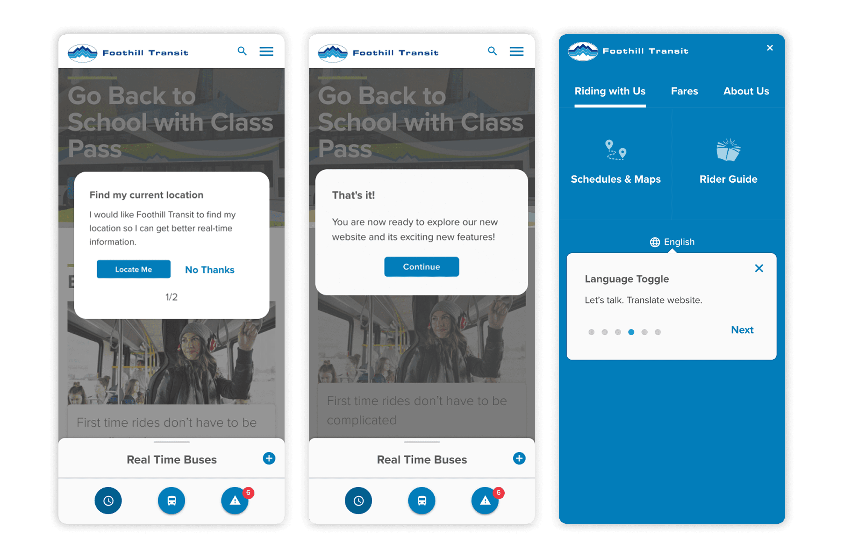
Onboarding mobile screens.

Modal onboarding tooltips and modals.
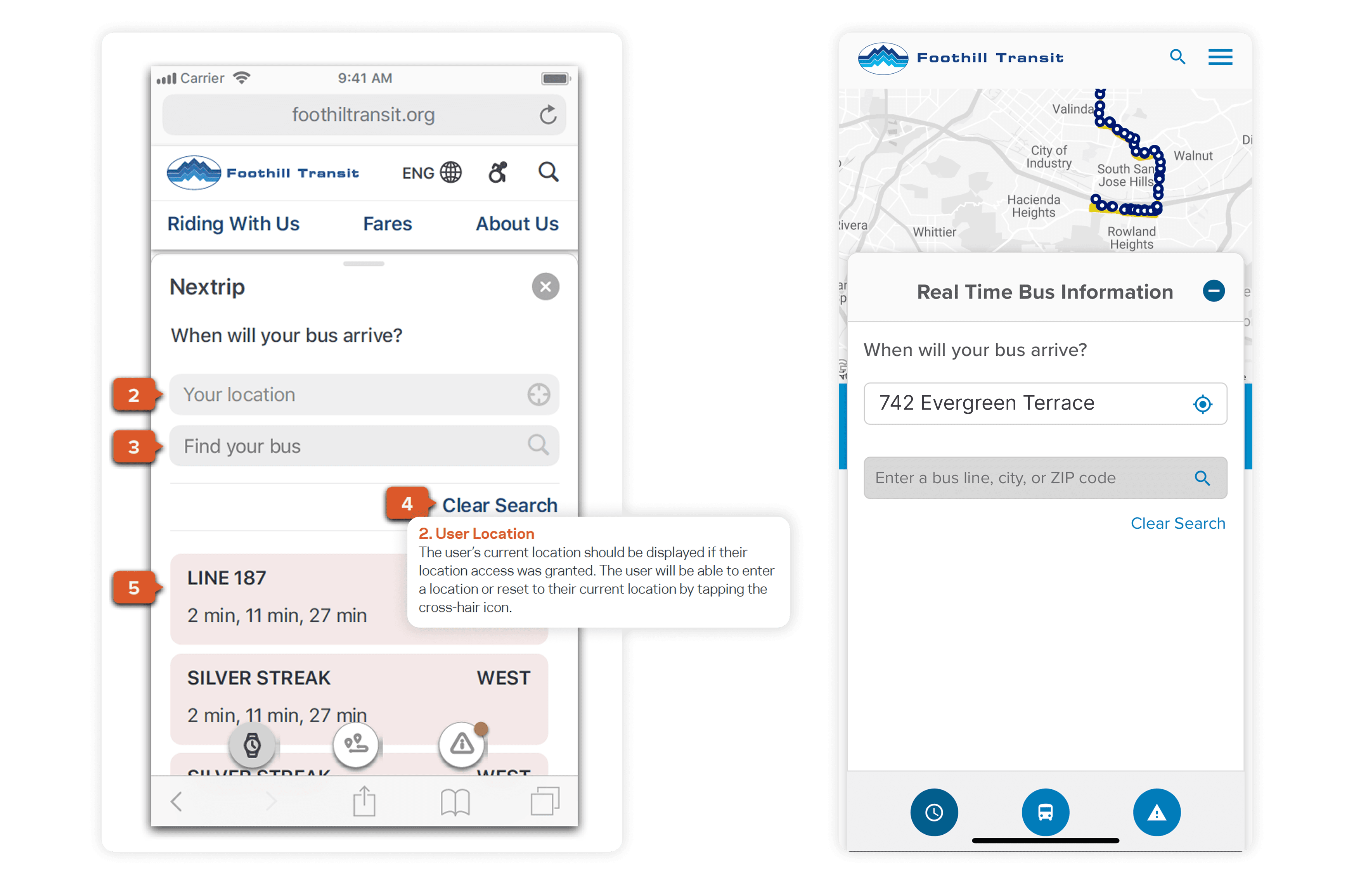
Geolocation wireframe with annotation and live site design.

Geolocation wireframe with annotation and live site design.

Contextual location access

One permission. Fewer repeated steps.

Requesting location access at first visit pre-populates the Trip Planner's origin field on every subsequent use, eliminating the most common source of repeated manual entry for daily commuters.

Trip planner

Always there. Never in the way.

The Trip Planner lives in a persistent sticky footer, accessible from any page without navigating away from content. A streamlined two-step flow offers Metro Planner and Google Maps as output options, respecting rider preference rather than forcing a single routing tool.
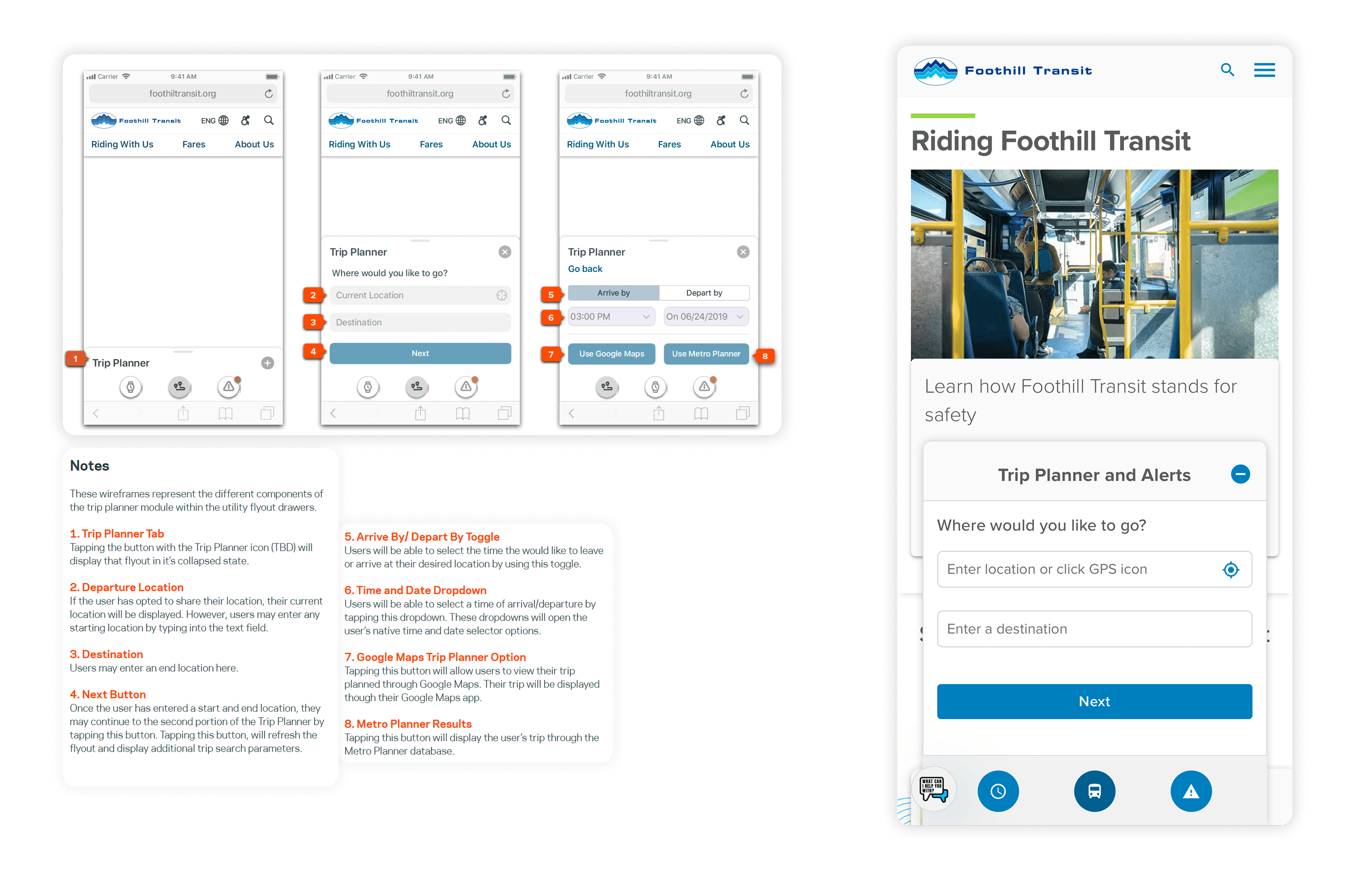
Trip planner wireframes with annotation and live site design.

Trip planner wireframes with annotation and live site design.

Real-time integration wireframes and designs

Real-time data integration wireframes, live-data flyout, and bus-locator screen designs.

Real-time data integration

Live data. Human interactions.

GTFS feeds provide raw real-time bus data, position, schedule deviation, service alerts. The design challenge was surfacing that data in interactions that feel like a helpful companion, not a technical dashboard. Alerts, live maps, and schedule updates all live in the sticky utility nav.

GTFS context: General Transit Feed Specification is the open standard for public transit data. Integrating a live GTFS feed means designing for data latency, feed outages, partial data states, and alert prioritization, all of which required explicit design specifications beyond the visual layer.

Accessibility

WCAG 2.1. Not as a checkbox.

Riders with disabilities are a significant share of Foothill Transit's ridership. WCAG 2.1 compliance was not a legal requirement to satisfy at handoff. It was a design constraint that shaped every structural decision: heading hierarchy, keyboard navigation order, contrast ratios, and the onboarding flow for assistive technology users.

GTFS feeds go stale. GPS positions lag. Alerts get delayed. The happy path is the last thing you design when real-time data is the product.

“As someone who relies on a screen reader, I often find transit sites impossible to navigate. This new site is awesome. It's structured, I know where to find things, and incredibly easy to use.”

Jorge Y., 37 • Screen reader user

“As someone who relies on a screen reader, I often find transit sites impossible to navigate. This new site is awesome. It's structured, I know where to find things, and incredibly easy to use.”

Jorge Y., 37 • Screen reader user

“As someone who relies on a screen reader, I often find transit sites impossible to navigate. This new site is awesome. It's structured, I know where to find things, and incredibly easy to use.”

Jorge Y., 37 • Screen reader user

“As someone who relies on a screen reader, I often find transit sites impossible to navigate. This new site is awesome. It's structured, I know where to find things, and incredibly easy to use.”

Jorge Y., 37 • Screen reader user

Impact

What we delivered

Design deliverables

01

39 Routes

Fully restructured in new IA

02

WCAG 2.1 Compliance

Keyboard nav · contrast · ARIA

03

GTFS Real-Time Integration

Live data UX specified end-to-end

04

5 Interaction Systems

Onboarding · Location · Trip Planner · Alerts · Accessibility

05

2 Routing Options

Metro Planner + Google Maps

06

Mobile-First Responsive

Designed for on-the-go use

Qualitative signals

Stakeholder feedback after launch indicated a measurable reduction in routine customer service call volume, the self-service goal the redesign was explicitly designed to achieve. Rider feedback confirmed the restructured navigation and real-time data tools made the service feel reliable in a way the legacy site never had.

Internal Foothill Transit usage data was not made available to the design team. If you have access to any stakeholder-reported figures post-launch, add them here with attribution.

Reflection

What I took forward

01

Task-based design beats persona labels when the audience is everyone

When you are designing for an entire region's riding public, shared tasks, check the bus, plan a trip, find a route, are more actionable than demographic segments. The tasks unified what the personas could not.

01

Task-based design beats persona labels when the audience is everyone

When you are designing for an entire region's riding public, shared tasks, check the bus, plan a trip, find a route, are more actionable than demographic segments. The tasks unified what the personas could not.

01

Task-based design beats persona labels when the audience is everyone

When you are designing for an entire region's riding public, shared tasks, check the bus, plan a trip, find a route, are more actionable than demographic segments. The tasks unified what the personas could not.

02

Real-time data is only as good as its empty states

GTFS feeds go stale, alerts get delayed, GPS positions lag. Designing for the failure cases first made every happy-path interaction more trustworthy.

02

Real-time data is only as good as its empty states

GTFS feeds go stale, alerts get delayed, GPS positions lag. Designing for the failure cases first made every happy-path interaction more trustworthy.

02

Real-time data is only as good as its empty states

GTFS feeds go stale, alerts get delayed, GPS positions lag. Designing for the failure cases first made every happy-path interaction more trustworthy.

03

Accessibility built into structure costs nothing. Bolted on later costs everything.

Because heading hierarchy, keyboard order, and ARIA strategy were defined at the wireframe stage, the development team had a compliance roadmap from day one, not a remediation list after QA.

03

Accessibility built into structure costs nothing. Bolted on later costs everything.

Because heading hierarchy, keyboard order, and ARIA strategy were defined at the wireframe stage, the development team had a compliance roadmap from day one, not a remediation list after QA.

03

Accessibility built into structure costs nothing. Bolted on later costs everything.

Because heading hierarchy, keyboard order, and ARIA strategy were defined at the wireframe stage, the development team had a compliance roadmap from day one, not a remediation list after QA.

Other projects

Enterprise B2B SaaS

Capital Group

Turned 25+ pages of paperwork into a platform. 65% adoption and 3500+ retirement plans implemented through Plan Manager since launch.

Research to Delivery

Design Systems & Governance

High-Fidelity Prototypes

WCAG Compliance

Systems-Level Thinking

Team Management

Enterprise B2B SaaS

Capital Group

Turned 25+ pages of paperwork into a platform. 65% adoption and 3500+ retirement plans implemented through Plan Manager since launch.

Research to Delivery

Design Systems & Governance

High-Fidelity Prototypes

WCAG Compliance

Systems-Level Thinking

Team Management

Enterprise B2B SaaS

Capital Group

Turned 25+ pages of paperwork into a platform. 65% adoption and 3500+ retirement plans implemented through Plan Manager since launch.

Research to Delivery

Design Systems & Governance

High-Fidelity Prototypes

WCAG Compliance

Systems-Level Thinking

Team Management

Enterprise B2B SaaS

Capital Group

Turned 25+ pages of paperwork into a platform. 65% adoption and 3500+ retirement plans implemented through Plan Manager since launch.

Research to Delivery

Design Systems & Governance

High-Fidelity Prototypes

WCAG Compliance

Systems-Level Thinking

Team Management

Website / Mobile

AltaMed

Six years, 46 user interviews, three redesigns, bilingual UX, and trust of thousands of patients reclaimed.

Research to Delivery

UX Strategy + Vision

User Research & Synthesis

Stakeholder Alignment

WCAG Compliance

Bilingual UX

Team Management + Leadership

Website / Mobile

AltaMed

Six years, 46 user interviews, three redesigns, bilingual UX, and trust of thousands of patients reclaimed.

Research to Delivery

UX Strategy + Vision

User Research & Synthesis

Stakeholder Alignment

WCAG Compliance

Bilingual UX

Team Management + Leadership

Website / Mobile

AltaMed

Six years, 46 user interviews, three redesigns, bilingual UX, and trust of thousands of patients reclaimed.

Research to Delivery

UX Strategy + Vision

User Research & Synthesis

Stakeholder Alignment

WCAG Compliance

Bilingual UX

Team Management + Leadership

Website / Mobile

AltaMed

Six years, 46 user interviews, three redesigns, bilingual UX, and trust of thousands of patients reclaimed.

Research to Delivery

UX Strategy + Vision

User Research & Synthesis

Stakeholder Alignment

WCAG Compliance

Bilingual UX

Team Management + Leadership