Rebuilding altamed.org around the patient, not the org chart.

Rebuilding altamed.org around the patient, not the org chart.

Rebuilding altamed.org around the patient, not the org chart.

Rebuilding altamed.org around the patient, not the org chart.

Altamed

Altamed

Altamed

Healthcare • Bilingual • Mobile First Website

Healthcare • Bilingual • Mobile First Website

End-to-End Product Design

UX Strategy + Vision

User Research & Synthesis

Stakeholder Alignment

WCAG 2.0 Compliance

Bilingual UX

Personas + User Journeys

Team Management + Leadership

Six years. Forty-six user interviews. A bilingual platform built to WCAG 2.0 standards, for the patients and caregivers who had been working around the system's limitations for years.

Six years. Forty-six user interviews. A bilingual platform built to WCAG 2.0 standards, for the patients and caregivers who had been working around the system's limitations for years.

ROLE

UX Lead, Sensis

Jun 2015 → May 2021

Launch

Aug 2017 + Ongoing

KEY METRICS

  • 3 full website redesigns

  • Self-serve tools reducing customer service calls

  • Patient confidence in services provided by AltaMed

  • Built trust and increased consumption of curated bilingual content.

  • WCAG Compliant

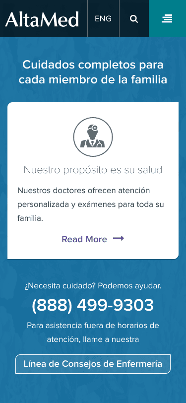
Altamed.org Spanish mobile site displaying information for seniors
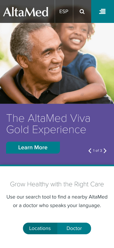
Altamed.org mobile site homepage
Altamed.org mobile site displaying provider search result information
Without a research lane, the product owners became the channel.

Context

The Largest Federally Qualified Health Center (FQHC) in Southern California

By 2015, altamed.org was desktop-only, navigation mirrored internal department structure, and Spanish content was not strong enough to build trust with a predominantly Spanish-speaking patient base.

Altamed homepage before and after. After displays mobile site.

Desktop-only, no self-service tools, navigation tied to internal structure

Screenshots showing progressive disclosure in action: (1) the contact replacement modal, (2) the employer contributions form with conditional fields. Stack vertically within the column. (3) Inline error messaging for contact cards.

01

The channel

Research flowed through product owners, not a formal UX lane. They were on calls with FAs, sponsors, and TPAs, ran user reviews, and fielded call-center feedback.

01

The channel

Research flowed through product owners, not a formal UX lane. They were on calls with FAs, sponsors, and TPAs, ran user reviews, and fielded call-center feedback.

02

My strategy

Build enough trust that those conversations became structured inputs, not noise filtered out before it reached me.

02

My strategy

Build enough trust that those conversations became structured inputs, not noise filtered out before it reached me.

03

What I synthesized

Abandonment patterns, error types by form section, terminology confusion, and the gaps in the FA and TPA handoff, mapped into journeys and pain-point inventories.

03

What I synthesized

Abandonment patterns, error types by form section, terminology confusion, and the gaps in the FA and TPA handoff, mapped into journeys and pain-point inventories.

Shipping is not the same as done. The launch revealed gaps a brief could not have predicted.

MY ROLE

Five Years. Two Phases.

Lead UX across the full engagement, from initial discovery through the 2017 launch and into research-driven iteration through 2021.

01

Ground-Up Redesign

Phase 1 · 2015-2017

Stakeholder interviews, IA, full annotated sitemap and wireframe library, content strategy direction, bilingual design, WCAG 2.0 compliance, development handoff. Launched August 2017.

01

Ground-Up Redesign

Phase 1 · 2015-2017

Stakeholder interviews, IA, full annotated sitemap and wireframe library, content strategy direction, bilingual design, WCAG 2.0 compliance, development handoff. Launched August 2017.

02

Ground-Up Redesign

Phase 2 · 2018–2021

Post-launch audit, 46 user interviews across three patient groups, persona development, and targeted refinements to navigation, Find a Doctor, homepage, and the Spanish experience.

02

Ground-Up Redesign

Phase 2 · 2018–2021

Post-launch audit, 46 user interviews across three patient groups, persona development, and targeted refinements to navigation, Find a Doctor, homepage, and the Spanish experience.

PHASE 1 RECAP · 2017 LAUNCH

01

Mobile-First Delivery

The first mobile-responsive version of altamed.org, built for patients who access healthcare from their phones.

02

Universal accessibility

First WCAG 2.0-compliant version, ensuring a consistent experience regardless of ability.

03

Intuitive navigation

Clinical terminology replaced with patient-facing language. Spanish introduced as original copy developed with native-language specialists, not auto-translated from English.

04

Simplified language direction

Errors surface at the field level, not at submission.

Wireframe flow of the AltaMed mobile navigation menu showing users drilling into nested service categories.

From the Phase 1 wireframe library.

Screenshots showing progressive disclosure in action: (1) the contact replacement modal, (2) the employer contributions form with conditional fields. Stack vertically within the column. (3) Inline error messaging for contact cards.

The only way to know what we got wrong was to go back and ask.

CHALLENGES · PHASE 2

Returning to What We Built

A post-launch audit and early feedback surfaced four gaps between what we shipped and what patients actually needed.

01

Technical debt + unfinished scope

Critical site areas left untouched at launch. Revisit core UX components for a complete, polished experience.

01

Technical debt + unfinished scope

Critical site areas left untouched at launch. Revisit core UX components for a complete, polished experience.

02

Unverified user assumptions

Phase 1 decisions built on assumed behaviors. Validate through deep-dive research grounded in real patient journeys.

02

Unverified user assumptions

Phase 1 decisions built on assumed behaviors. Validate through deep-dive research grounded in real patient journeys.

03

Caregiver navigational hurdles

Caregivers could not find clear information while managing complex family medical needs. Map their daily tasks and friction points.

03

Caregiver navigational hurdles

Caregivers could not find clear information while managing complex family medical needs. Map their daily tasks and friction points.

04

Low Spanish content engagement

Spanish options underused due to translation quality and low visibility. Work with native-language copywriting specialists; improve discoverability.

04

Low Spanish content engagement

Spanish options underused due to translation quality and low visibility. Work with native-language copywriting specialists; improve discoverability.

“Managing my parents' appointments is a second job. I need to know what services are available for seniors at our local clinic without having to call and wait on hold every time.”

— Sergio G., 45 · Caregiver research participant

“Managing my parents' appointments is a second job. I need to know what services are available for seniors at our local clinic without having to call and wait on hold every time.”

— Sergio G., 45 · Caregiver research participant

“Managing my parents' appointments is a second job. I need to know what services are available for seniors at our local clinic without having to call and wait on hold every time.”

— Sergio G., 45 · Caregiver research participant

“Managing my parents' appointments is a second job. I need to know what services are available for seniors at our local clinic without having to call and wait on hold every time.”

— Sergio G., 45 · Caregiver research participant

Research

AltaMed research participants

AltaMed research participants

46 interviews. Two languages. Three patient worlds.

Six months after launch, I led 46 structured interviews across three distinct patient groups, the first time altamed.org decisions would be grounded in real behavior, not assumption.


Each group identified inlcuded English speaking participants and participants with Spanish speaking only and/or Spanish as their preferred language.

Interview guide.

Interview discussion guide used during research and segment user flows.

Forty-six interviews. Three patient worlds. One finding in common: the site was organized around how AltaMed works, not how patients live.

Personas + insights

Three research groups. Four resulting personas.

Three distinct patient profiles.

Each group was represented as English speakers and Spanish as their only language or language of preference. A fourth persona was created that merges two of the groups we spoke to.

01

Gen X + millennials

Low tolerance for friction. Expects efficiency at every step. Frustrated by complex booking and long wait times. Wants to feel like an individual, not a number.

02

Dedicated caregivers

Overwhelmed managing family healthcare alongside their own. Unaware of the full range of services available. Values compassion and scheduling flexibility above all.

03

Spanish-preferred patients

Trust built through quality content, not automated tools. Seeks cultural cues that prove AltaMed understands their community. Language preference directly affects willingness to engage.

Stacked screenshots of the AltaMed mobile navigation menu redesign in purple.

AltaMed personas.

Trust is not just translation. It is evidence that the organization understands your world.

Experience strategy

Research translated into direction

Each pillar traces back to a specific finding from the 46 interviews.

01

Authentic linguistic inclusion

Directed content development with native-language copywriting specialists, using research findings from Spanish-preferred patient interviews as the brief. The result was Spanish content that read as original, not adapted.

02

Research-driven architecture

Sitemap and navigation rebuilt around how patients search, not how AltaMed is organized internally.

03

Proactive language guidance

Sitemap and navigation rebuilt around how patients search, not how AltaMed is organized internally.

04

Frictionless care access

Find a Doctor refined for mobile, essential actions within the viewport, decision fatigue reduced.

Navigation was the first place patients encountered the site. It was also the first place they gave up.

Information architecture

Sitemap + navigation

Navigation was the first place patients encountered the site and the first place they gave up. I rebuilt the sitemap and filter taxonomy around how patients search, not how AltaMed is organized.

Mobile stie navigation

Panels display three layers of the mobile navigation.

ANNOTATED SITEMAP — Phase 2, Full Width. Lead artifact. Full-width export with IA callouts: navigation rename, caregiver pathway, PACE enrollment entry point.

Annotated sitemaps: Phase 1 and Phase 2 sitemaps with annotation.

Design decisions

Homepage overhaul

Passive to purposeful

Patients arrived with specific intent: find a doctor, find a location, understand a service. I replaced the hero carousel with task-prioritized modules, fewer clicks, faster access to care.

Mobile and desktop homepage

Final mobile and desktop homepages.


Find a doctor tool
Find a doctor tool

Find a Doctor flow chart and Find a Doctor. Final Mobile (3 states). Filter state + results state. 2-up format tells the full flow.

Find a doctor tool

Reducing decision fatigue at the highest-intent moment

The most critical conversion path on the site, and the most cluttered. I consolidated filters, tightened labels, and moved "no preference" to the top of each filter to cut steps at the moment of highest intent.

Spanish site optimization

Trust is not just translation

Spanish-preferred patients needed cultural signals, not just translated words. I directed content development with native-language copywriting specialists, using interview findings as the brief. A proactive language toggle was added on arrival, small in footprint, significant in trust.

NOTE: I did not write copy on this engagement. A designated copywriter developed all content. I provided research-grounded direction and ensured all content decisions aligned with findings from Spanish-preferred patient interviews.

Spanish content
Spanish content

Altamed site screens with Spanish content including language toggle appearing upon first visit.

“The Spanish version feels like it was actually written for me, not just run through a computer. It gives me a lot more confidence that I'll be understood when I walk into the clinic.”

— Jessica P., 32 · Spanish-preferred research participant

“The Spanish version feels like it was actually written for me, not just run through a computer. It gives me a lot more confidence that I'll be understood when I walk into the clinic.”

— Jessica P., 32 · Spanish-preferred research participant

“The Spanish version feels like it was actually written for me, not just run through a computer. It gives me a lot more confidence that I'll be understood when I walk into the clinic.”

— Jessica P., 32 · Spanish-preferred research participant

“The Spanish version feels like it was actually written for me, not just run through a computer. It gives me a lot more confidence that I'll be understood when I walk into the clinic.”

— Jessica P., 32 · Spanish-preferred research participant

Impact

What we delivered

01

46 User Interviews

Across 3 patient groups

02

3 Validated Personas

Research-grounded, team-aligned

03

WCAG 2.0 Compliance Achieved

First for altamed.org

04

EN + ES Bilingual Parity

Native-specialist content directed against research findings

05

2 Annotated Sitemaps

Phase 1 + Phase 2.A

06

Mobile-First Responsive Build

First for altamed.org

Organizational context

Post-launch research confirmed reduced reliance on the patient services line and higher trust from Spanish-preferred users. The following organizational figures represent AltaMed's broader 2019–2021 outcomes.

The website was one part of a multi-initiative access strategy.

01

+76% Medical Visits

505K → 891K · 2019–2021

02

-29% ER Utilization

2,764 → 3,545 members

03

+28% PACE Membership

Medi-Cal population per 1,000

Source: altamedfoundation.org

Context: Multiple clinical, operational, and expansion initiatives were underway concurrently. AltaMed has not publicly isolated the website's contribution to these outcomes. Source: California Health Facilities Financing Authority.

Reflection

What I took forward

01

Design for the journey, not just the page

The site was one node in a longer patient experience. Aligning every touchpoint to the real care pathway is what actually reduces friction.

01

Design for the journey, not just the page

The site was one node in a longer patient experience. Aligning every touchpoint to the real care pathway is what actually reduces friction.

01

Design for the journey, not just the page

The site was one node in a longer patient experience. Aligning every touchpoint to the real care pathway is what actually reduces friction.

02

Bilingual UX is a design discipline, not a translation task

Spanish-preferred patients need evidence the organization understands their world. That distinction lives at the content level, not the settings menu.

02

Bilingual UX is a design discipline, not a translation task

Spanish-preferred patients need evidence the organization understands their world. That distinction lives at the content level, not the settings menu.

03

Continuous research is not optional in healthcare.

Patient behavior and trust signals shift faster than most organizations expect. We only knew what to fix because we went back and asked.

03

Continuous research is not optional in healthcare.

Patient behavior and trust signals shift faster than most organizations expect. We only knew what to fix because we went back and asked.

03

Continuous research is not optional in healthcare.

Patient behavior and trust signals shift faster than most organizations expect. We only knew what to fix because we went back and asked.

Other projects

Enterprise B2B SaaS

Capital Group

Turned 25+ pages of paperwork into a platform. 65% adoption and 3500+ retirement plans implemented through Plan Manager since launch.

Research to Delivery

Design Systems & Governance

High-Fidelity Prototypes

WCAG Compliance

Systems-Level Thinking

Team Management

Enterprise B2B SaaS

Capital Group

Turned 25+ pages of paperwork into a platform. 65% adoption and 3500+ retirement plans implemented through Plan Manager since launch.

Research to Delivery

Design Systems & Governance

High-Fidelity Prototypes

WCAG Compliance

Systems-Level Thinking

Team Management

Enterprise B2B SaaS

Capital Group

Turned 25+ pages of paperwork into a platform. 65% adoption and 3500+ retirement plans implemented through Plan Manager since launch.

Research to Delivery

Design Systems & Governance

High-Fidelity Prototypes

WCAG Compliance

Systems-Level Thinking

Team Management

Enterprise B2B SaaS

Capital Group

Turned 25+ pages of paperwork into a platform. 65% adoption and 3500+ retirement plans implemented through Plan Manager since launch.

Research to Delivery

Design Systems & Governance

High-Fidelity Prototypes

WCAG Compliance

Systems-Level Thinking

Team Management

Website / Mobile App

Foothill Transit

Third-party integration real-time trip planning and management for daily riders.

Research to Delivery

Real-Time Data UX

WCAG 2.1 Compliance

Information Architecture

Third-Party Integration

Team Management + Leadership

Mobile Design

Website / Mobile App

Foothill Transit

Third-party integration real-time trip planning and management for daily riders.

Research to Delivery

Real-Time Data UX

WCAG 2.1 Compliance

Information Architecture

Third-Party Integration

Team Management + Leadership

Mobile Design

Website / Mobile App

Foothill Transit

Third-party integration real-time trip planning and management for daily riders.

Research to Delivery

Real-Time Data UX

WCAG 2.1 Compliance

Information Architecture

Third-Party Integration

Team Management + Leadership

Mobile Design

Website / Mobile App

Foothill Transit

Third-party integration real-time trip planning and management for daily riders.

Research to Delivery

Real-Time Data UX

WCAG 2.1 Compliance

Information Architecture

Third-Party Integration

Team Management + Leadership

Mobile Design